Dream Home Decor Plan: Color, Furniture & Finishing Touches
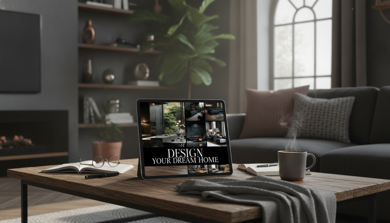
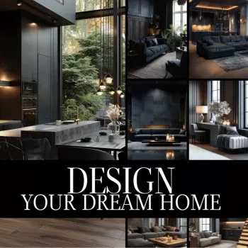
Design Your Dream Home: A Practical eBook for Decorating with Color, Furniture, and Finishing Touches
A beautiful home comes from clear choices: a cohesive color plan, furniture that fits the room, and decor that adds personality without clutter. This guide-style eBook helps turn scattered inspiration into a step-by-step plan—room by room—so each decision supports the look, feel, and function of the space.
If you want a structured roadmap you can follow at your own pace, start with the Design Your Dream Home eBook (digital download), then use the tips below to turn ideas into a home that feels pulled together.
Start with a Vision That Matches Real Life
Decorating gets easier when the “vibe” and the practical needs are defined before shopping. A room that looks perfect online won’t feel right if it doesn’t support how you actually live.
- Define the mood first. Pick a feeling for each space—calm, energetic, cozy, formal—before choosing paint or furniture.
- List daily activities. Note what happens in the room (work, entertaining, relaxing) and what has to be stored there.
- Collect targeted inspiration. Aim for 10–20 images per room, then highlight repeating elements like wood tones, silhouettes, metals, and color families.
- Choose 3–5 guiding words. Examples: “airy, warm, textured, modern.” If an item doesn’t match those words, it’s a pass.
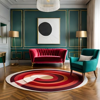
Color Schemes That Feel Cohesive from Room to Room
A whole-home palette prevents the “almost matching” problem—where finishes are close, but not quite, and the space feels accidental. Start by deciding whether the home leans warm or cool, then build from there. If you want a refresher on how hues relate, the fundamentals of the color wheel are a helpful reference point.
- Pick a whole-home palette. One main neutral, one supporting neutral, and 2–3 accents is usually plenty.
- Use the 60–30–10 approach. Roughly 60% dominant color (often walls/large surfaces), 30% secondary (large furniture/rugs), 10% accents (pillows, art, accessories).
- Decide undertones first. Warm vs. cool choices should be consistent across paint, flooring, and upholstery.
- Plan transitions. Between adjacent rooms, repeat at least one color or material (oak tone, black metal, brass, linen texture) so the eye moves smoothly.
Quick color plan examples
| Style direction | Main neutral | Supporting neutral | Accents | Best for |
|---|---|---|---|---|
| Warm modern | Soft white | Greige | Terracotta + olive + black | Open-plan living areas |
| Coastal calm | Warm white | Sand beige | Sea glass + navy + brass | Bedrooms and relaxing spaces |
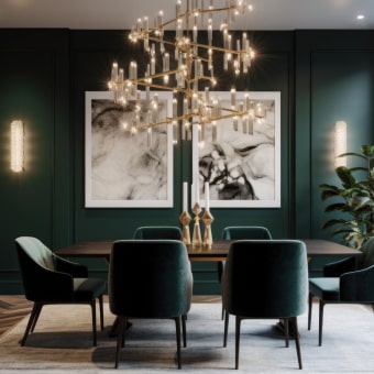
| Classic contrast | Crisp white | Charcoal | Camel + deep green + gold | Dining rooms and entries |
| Light Scandinavian | Off-white | Pale oak tone | Dusty blue + clay + matte black | Small spaces needing brightness |
Furniture Layout: Scale, Flow, and Comfort
Even beautiful furniture looks “off” if the layout blocks pathways or the scale is wrong for the room. The goal is a plan that supports movement, conversation, and comfort—without turning the space into an obstacle course.
- Measure first. Map door swings, outlets, vents, and walkways. Keep comfortable paths through key areas.
- Anchor seating with the right rug size. A common rule is to fit the front legs of major pieces on the rug for a grounded, intentional look.
- Choose one focal point. Fireplace, TV wall, a window view, or statement art—then arrange seating to acknowledge it.
- Mix heights and shapes. Pair low profiles with taller bookcases, floor lamps, or high-back chairs to avoid a flat silhouette.
- Right-size for the room. In smaller spaces, edit bulky pieces and favor furniture with legs to keep the floor visually open.
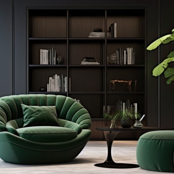
Decor That Adds Character Without Feeling Cluttered
Finishing touches should look collected and personal, not crowded. A simple rhythm keeps the room styled while still breathable.
- Use “repeat, vary, rest.” Repeat a material (wood, black metal, brass), vary texture (linen, boucle, ceramic), and leave negative space.
- Layer lighting. Combine ambient + task + accent lighting so the room feels finished morning to night. For practical guidance on efficient bulbs and lighting choices, see the U.S. Department of Energy’s lighting basics.
- Build vignettes with odd numbers. Group items in 3s or 5s, and vary height to create movement.
- Add natural softness. Plants, branches, rattan, and stone help balance hard lines and add depth.
- Pick one statement piece per zone. One bold artwork, one standout mirror, or one sculptural vase often does more than many small items.
Room-by-Room Game Plan
Common Decorating Mistakes and Fast Fixes
A Simple Decorating Checklist for Confident Decisions
If budgeting is part of decorating with less stress, the Zen-Savvy Savings Checklist can help you set clear spending limits and prioritize what matters most before you hit “add to cart.”
Digital Guide: What the eBook Helps Solve
When you’re ready to put the full process into action, the Design Your Dream Home | Home Decoration Ideas eBook | Digital Download Guide for Interior Design, Color Schemes, Furniture & Decor Inspiration is designed to be practical, room-friendly, and easy to revisit as your home evolves.
FAQ
How does a digital decorating guide help when starting from scratch?
It gives you a clear sequence—vision, palette, layout, then layering—so you’re not guessing with every purchase. That structure reduces decision fatigue and helps you avoid common issues like wrong-scale furniture, clashing undertones, and over-accessorizing.
What’s the easiest way to choose a color scheme that flows between rooms?
Start with a whole-home neutral base, repeat one or two accent colors throughout the house, and keep undertones consistently warm or cool. The 60–30–10 approach helps balance those colors within each room without making everything match exactly.
What should be bought first when decorating a room?
Begin with large anchor pieces and any textiles that drive the palette (like a rug or curtains), then choose paint to coordinate. After that, add lighting and finish with art and accessories—always measure first to make sure items fit.


Leave a comment